Well, of course tried some different color combinations today and some were more successful than others!
It was worth a try to do some of the combos as I probably won't do them again but you always learn!
This group was rather dark and was mostly Strongest Red, Strongest Orange and Intense Blue. I tried to keep the Orange and Blue separate but they overlapped and they do make a great brown! Navy and Strong Orange make a superb brown or black depending upon how much of the orange you use. I liked this bunch the best of what I did.
This is the 22 inch square that went with the above. That lightly dyed batik that I bought is working fabulously as a pfd fabric!! You can't see any of the original color (not that there is much of it anyway!!).
This was my second favorite bunch but you can see that there was still not enough contrast and it probably could have done with one of the more intense colors. It was Grape, Strongest Red and Strong Orange. I may have thrown a little yellow on as well. It is okay but...
Here is the accompanying piece and you can see the yellow here. It illustrates the problems with the smaller pieces above which have too much of one color. This is okay if you are using one of the darker hues but doesn't work as well in the lighter hues as there isn't enough value contrast. I should note that all the pictures in the last few blogs are of un-ironed fabric tht I put on my design wall.
This group was the least successful although I am sure I can find uses for them. It was a combination of yellow, Strong Orange and Strongest Red. One of these should be in the above group instead of this one as it has Grape in it. The yellow spreads too much and makes the red into orange!
This is the accompanying piece from the above grouping.
Well, did have to try a possible quilting combination!! Maybe add some more yellow in those empty places.
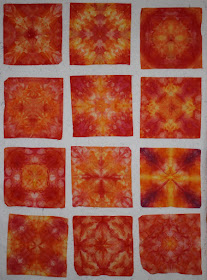
Well, Thursday was another day for experimenting. A few days ago I successfully dyed some remnants of non pdf fabric in a small size so I decided that it would be very useful to have a bunch of these smaller mandalas as they would be more like quilt blocks. As you do these mandalas in smaller and smaller sizes, it becomes more difficult to get enough variety across the piece as you are working with a smaller surface and the dyes are hard to control as you are applying them over ice. These are 11 x 11 inch squares. I had 12 but somehow one has disappeared! Don't know at which stage it disappeared or whether the washing machine ate it!
After I had finished my hand washing of these pieces, I was sure I had my first real color failures!! They were really ugly -- brown and loden green all over. After going through the Synthrapol wash in hot water in my washing machine and then the dryer, I was very pleased with the results and call it another success.
This is the picture of all 11 -- you will notice the bottom two don't have as much variation in color.
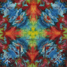
These are the two 22 inch pieces that were underneath the 12 pieces. Hadn't intended to coordinate them -- just wanted to test some fabric that I had bought suspecting it would dye well -- it was a very very pale color but obviously a batik and the price was right. You can see it worked just fine! I had drop cloths above all the folded pieces as well as right on the rack so it was quite a sandwich of fabrics.
Here are the blue/green ones -- all 12 this time!
These are the two larger pieces that were under the blue/greens.
Seeing them altogether, it occurred to me that I could make arrangements of the big and small for quilts. This was one thought.
Another thought.
This is a variation of the quilt I made the other day with the reject mandala. Having the squares next to the block on the diagonal was a thought I had back with that quilt but didn't have the fabric that looked right. I kind of like this!
The other block with accompanying small pieces.
Two using the other large squares, the bottom one mixing it with the blue blocks.
I also did two t-shirts to match my red capris which they do! Now to do a couple with black stripes as that is the color I usually wear!!
The next three are the drop cloths that sat underneath the folded fabrics on the three racks.
I like the subtle shadings in these non-pfd muslin fabrics that were hanging about. I am thinking I am going to do a lot more of these matching small and large mandalas as I can see real uses for them. Maybe I will even go smaller with some of my remnants and I haven't tried this on silk yet.......Not enough time for all my thoughts.
Some of the quilts in today's Show and Tell were spectacular!! This was hand pieced by new member Jean Lamond and won first place at NY State Fair. Anyone who has seen my blog knows how much I love radial symmetry and this ws just a wow -- everything: color, design and workmanship!
This is the raffle quilt for the Irondequoit Quilt Club and was also gorgeous!!
Here is a closeup of some of the Mariner's Compasses that make up the quilt.
Pat Pauly did this luscious quilt using her own dyed and monoprinted fabrics -- wonderful color!
This was another of the beautiful creations shown today.
Tina Somerset is one of our newer members whose quilts I have shown before. She is teaching at Patricia's Fabric House here in Rochester and if I were here, I would definitely be in her class! This is one of the pieces she did as part of an online class.
This is another piece she did as part of the class. At first she showed it as the vertical version but said the teacher preferred the horizontal. For some reason, I can't get the vertical version to show!
This is a series of three pieces done by Ann Nash who is a fantastic hand quilter. These were from patterns by Kumiko Sudo and are three dimensional. She uses them as door hangings for each season.
I really liked the use of scraps in this quilt. The woman who did it said that her husband basically did the design as she was stuck. She then quickly sewed it together and it is a really nice top.
We had an incredible display of our "comfort" quilts which are donated to various charities in the area. They were moving across the stage so fast, I barely got any pictures which is why I have them so small -- to disguise the blurriness! I wanted to remember all these great uses of scraps though. Easy quilts but really great looking. There were so many different ones today -- even I handed in four!
I finally finished quilting the Reject Mandala quilt. I didn't use the flash for this picture so the color is bit off but you can see the quilting in the white area. There is some quilting in the mandala pieces but you can't see it. I didn't do any quilting in the border and I have now added a darker green binding and will sew that on tonight.
In addition to the 12 mandalas I did, I did five t-shirts for my granddaughter using her favorite color -- turquoise! I wasn't sure whether it would work even with the step I take of nuking it at the end. Obviously it did! All the t-shirts have two shades of blue and grape so hopefully she will like them!! She is 7 and not yet as picky as some of the older kids. The t-shirts did confirm my belief that the Kmart t-shirts dye the best. These were okay but not as bright as those I do with the Kmart Basic Editions shirts. These were from a dye house and were Hanes heavy but very reasonably priced.

The Following six pieces were done adding Strongest Red (Prochem name for a non-pure red) that was probably six or seven years old. I was worried that it would leave spots on the fabric so I put a drop cloth on top of some old stained 200 thread count muslin that was stored near my dye area. I also used turquoise on some of these although not so much on this bunch. I was thrilled with the results. I did add a little Strong Orange and Sun Yellow as well. They were scrunched six to a cookie rack stacked at least two deep.
These next six were done using the Intense Blue, the greens and Turquoise. I was very pleased with the results. I was afraid this whole bunch of 12 wouldn't turn out because I was experimenting with new colors and was using my best pfd fabric (Hoffman 1377). I was overwhelmed with the results.
These were two of the drop cloths I used. I believe the first one was the one I covered the fabric with and the second was underneath the more colorful mandalas. The fabric is definitely not mercerised but the color was nice and it covered up all the spots that I had splashed on this fabric and was a good use of it!


