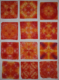
It was worth a try to do some of the combos as I probably won't do them again but you always learn!
This group was rather dark and was mostly Strongest Red, Strongest Orange and Intense Blue. I tried to keep the Orange and Blue separate but they overlapped and they do make a great brown! Navy and Strong Orange make a superb brown or black depending upon how much of the orange you use. I liked this bunch the best of what I did.
This was my second favorite bunch but you can see that there was still not enough contrast and it probably could have done with one of the more intense colors. It was Grape, Strongest Red and Strong Orange. I may have thrown a little yellow on as well. It is okay but...
Here is the accompanying piece and you can see the yellow here. It illustrates the problems with the smaller pieces above which have too much of one color. This is okay if you are using one of the darker hues but doesn't work as well in the lighter hues as there isn't enough value contrast. I should note that all the pictures in the last few blogs are of un-ironed fabric tht I put on my design wall.
This group was the least successful although I am sure I can find uses for them. It was a combination of yellow, Strong Orange and Strongest Red. One of these should be in the above group instead of this one as it has Grape in it. The yellow spreads too much and makes the red into orange!
This is the accompanying piece from the above grouping.
Well, did have to try a possible quilting combination!! Maybe add some more yellow in those empty places.


I actually like your least successful group the best!
ReplyDeleteSandy in the UK
Thanks, Sandy! The only reason I chose them as the least successful is I like the multi-color ones better. I am even tired of the blue/green ones now which are everyone's favorites. These orange/yellow ones are very bright and will be great with some green or purple to tone them down a bit!
ReplyDelete