Showing posts with label gradation dyeing. Show all posts

Sunday, March 7, 2021

Some Dyeing Results and Miscellaneous Updates of In Process Projects

The brown quilt top is finally completed and is a good size at 56 x 70.


The first block in the Passacaglia quilt is finished!


I spent the day dyeing with my friend Dianne and had decided to do something quite mundane but necessary for my further education!  I just did gradations of some colors I hadn't done straight gradations of before.  From left to right are Pro Chem Blue 420 which is a new pure color.  Second is Black 402a - Cotton Black, and next is Black 604 - New Black.  I started with 8% for the blue and 10% for the blacks.  I had a lot of leakage in the bags so am a little uncertain about those darkest colors.  The Cotton black tended to green in the darkest shades and did look like gray in the lighter shades so will be good for shading colors.  The New Black was definitely tending toward blue in all shades!  I will be overdyeing the blacks most likely although I have decided with what yet!!


This was an attempt to get a redder red by mixing Mixing Red with Strong Orange -- both pure colors.  I did four parts red to orange and is still came out more coral than red in the darker shades (8%).  I don't have any pinks in my stash so will keep these as is.


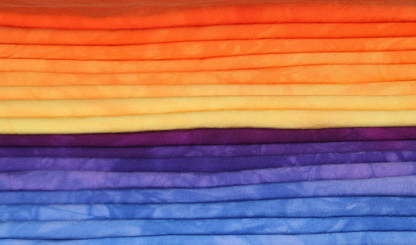
I still have a lot of pfd fabric but we are planning another marathon dye/overdye session where we use 10 colors to come up with 35 different results!!  That will definitely put a dent in my stash of pfd fabrics!!
 

Tuesday, December 15, 2020

A Day of Dyeing at Dianne's!

Before I came to the beach this year, I gathered most of my pfd fabric so I could get some dyeing done down here.  I couldn't do any this summer because of the surgery.


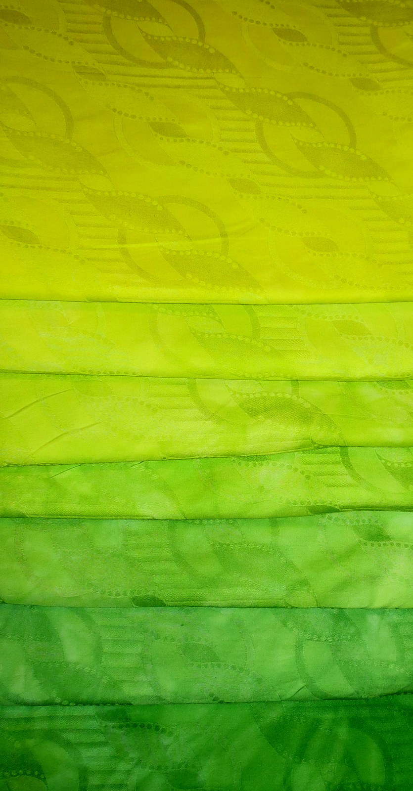
This is my second day of dyeing and I was experimenting with this new blue -- ProChem's Blue 420 which is a new color and which I am not sure still whether it is a pure dye or not.  It is not noted as such on their website.  I did three gradations using this color in combination with other colors to see if I could recreate some other colors.  I had a day of mixed successes.


This gradation is a gradation of this blue (starting with 6%) with a 3% concentration of yellow added to half and 1 1/2% concentration added to the other half.  It is actually greener than this picture portrays. 

This is the same blue but with a 2% solution of ProChem's Mixing Red added to each step.
I thought I would try adding some Black to Grape to see if I could get a more intense purple.  It was not very successful.  I only used a 6% solution of the Grape and a 2% solution of the black and then gradated them together.  I think the black was just too light and tended toward blue.


This was an error!  I mixed the Mixing Red and the Blue 420 together and then did a gradation of that.  I had meant to add the Mixing red to each gradation and did that in the gradation further up in this blog.  This was Mixing Red (2%) and Blue 420 (6%) added together.


Here they are altogether.  I think my next foray into dyeing will be to do gradations of a lot of the miscellaneous mixed dyes I have.  There are quite a few I don't have documented in my book and I hate guessing with dyeing!
 

Tuesday, November 20, 2018

Challenge Quilt and Days of Dyeing

QBTS  periodically  has challenges and I try to participate when I can.  I have liked a couple I have done and not liked some of the others.  This is one of those "some of the others".  The challenge for me was a difficult one.  You took one fabric (and only one as I read the instructions) that read as orange.  Could be anything.  You could only use a solid orange and white (or cream or a white with orange on it print) in addition to the main fabric.  The piece has to measure between 48 inches around to 144 inches around.  You could use embellishments as long as they were orange or white.  You could also introduce no more than 2 sq inches of another fabric.

I chose a print that was very even and a very poor candidate for stack and whack.  I had another print that was better but I would have had to do a lot of fussy cutting as I didn't have enough as it was in four fat quarters.

I did the stack and whacks and three came out with one look and four with another look.  The three and four were almost identical (not quite).  I decided to only use five of them and make a table runner.  You can't believe how many times I undid these which is so unlike me.  This was because I wanted to use just a tiny amount of the black between the blocks to give them an elongated Christmas bulb look I had seen on Pinterest.  I stayed within the 2 square inch qualification as each black square is 1/2 in finished!  I used some orange I had to finish off each end.  I am thinking I will  use more of the orange to do the binding.  

Well, here it is finished!  I followed the instructions.  I would have preferred, due to my scrappy nature, to have used a bunch of oranges (which I had) but the directions said "an" orange print.

Well, Dianne and I planned to do one of our massive overdyes where you get 35 different fabrics in two dyeing sessions.  However, when we got together, we decided that we would rather do some gradations and then maybe overdye.  We planned to do this original plan in two days as we are both a bit gimpy these days.  I ended up doing four gradations that first day -- strong orange, golden yellow (but starting with only a 3% concentration instead of my usual 6%), turquoise, and a mix of turquoise (2/3) and intense blue (1/3).    The second day we overdyed.  When you do these 8 step gradations, frequently there is little differentiation between those pieces sitting right next to each other.


My results were uneven!  My turquoise and turquoise/intense blue gradations were almost identical and I couldn't tell the difference when laundered except on maybe one piece.  I assumed that the ones that had a bit more mottled were the intense blue/turq mix but not sure as the color looked so much the same.  When I did the second wash of the orange and yellow, I threw in the turquoise as well which was a mistake as just a hint of the color greyed the yellows and oranges just a bit in the lighter hues.

One of the real successes for me was when we made a mistake.  Instead of adding plain water to the dry fabric before applying the color for the golden yellows, we used the soda ash solution by mistake.  This resulted in nicely mottled yellows which you generally do not get with yellows as the color seems to spread more than some of the other colors.  Turquoise is another color that tends to spread a lot and not get a mottled look.

Day 2 was overdyeing. I had dyed 35 yards the first day and overdyed 16 the second.  So I took a bunch of the turquoise and overdyed with sun yellow to get the yummy lime greens which are always useful.  I also overdyed several of the really light ones with neutral gray which is a very weak dye.  I also overdyed some of the strong oranges that were weaker with fuchsia which as usual totally took over but was not as mottled as fuchsia usually is because of some color already on the cloth.  I am going to take a couple of these fuchsias and overdye them with strong orange which in my experience gives the best reds ever!

I should also comment that we spray basted five of my somewhat large quilts.  We were both totally exhausted at the end of those two days!!  I am getting too old to be on my feet for hours at a time even with lots of sit downs!

My goal was to get a bunch of fabrics in lighter colors of which I have very little   --   although I certainly have tons of dyed fabric!!  I have already cut up one of the golden yellows as the first border on a quilt on my design wall -- the mystery quilt -- it is perfect!


Monday, January 9, 2017

City Lights is Finally Sewn Together!

I am very happy with how City Lights turned out and will keep it in this horizontal orientation.  I think the green represents trees and little park areas while the blue areas are ponds.  The rest is made up of shopping centers and tall buildings casting shadows.

This is the vertical representation.

I finally ironed the gradated Boysenberry to Basic Blue.  The deepest shade is 10% Boysenberry and 3% Basic Blue.  It is really rich and dark as are the 5% and 2.5% Boysenberry.  The Basic Blue is 3% in each piece.

 This is the 2.5% Boysenberry and 3% Basic Blue.  I really liked this one and the next one which is 5% Boysenberry and 3% Basic Blue.


I thought this one was very rich looking!

This is the Strongest Orange overdyed with the 3% Sun Yellow.  They are all ironed now and that is the most fun part of the dyeing process!!

Here they are all stacked up and made me think that I need to do gradations between all the different colors.  I know I have a yellow to green one but that leaves green to blue and an orange to red.  Hmm.


Saturday, December 17, 2016

A Dyeing Day with Dianne and Becky

What a fun day of dyeing I had on Monday at friend Dianne's.  I wanted to do some gradations to fill in what I had in the way of colors down here, especially wanting some Basic Blue and Purple.  This was a gradation of Basic Blue with a 3% solution of Grape added to each step.  I was surprised at how much the purple changed the darkest of the Basic Blues.  Basic Blue is the only one of the Procion pure colors that tends towards red rather than green (turquoise, intense blue and navy are all tending to green).  A little like fuchsia, the Basic Blue hits really fast while the Grape acts more like the yellows or turquoise and tends to spread more evenly.  There is a lot of mottling.

I also did a straight gradation of Basic Blue.  This fabric makes the best skies.

Here are the two sets next to each other.

 I  had bought some blanks from Dharma this summer to make some dresses, t-shirts and blouses for my granddaughter who is 8.  The first was my favorite of the dresses -- it is a cotton velour and is perfect for her.  I basically just laid it out slightly scrunched with the bottom two garments and put turquoise on the top, intense blue in the middle and then grape on the bottom hoping for somewhat of a gradation.  I added the soda ash later as I wanted a more gradual look and not the highly mottled look you would get if you had soaked them first.  I should have washed the garments before dyeing as they repelled the dye at first and I had to do a lot of squishing to get the dye all the way through.  The second and third garments are just a cotton knit and dyed okay but not as bright as the velour.

Hard to see but there is smocking on the very top of this blouse.


Wednesday, April 13, 2016

A Last Day of Dyeing Before Heading Back North!!

My friend Dianne and I spent the day doing both a small overdyeing sequence and a couple of gradations.  The gradation dyeing which I have talked about in previous blogs is based upon low water immersion dyeing (Ann Johnston) and her books were my first "bibles" of dyeing. Ann uses tsps and tbsps for measuring dyes.   I was converted to measuring my dyes scientifically by Carol Soderlund in the class where she has you do sequenced overdyeing of three color palettes.  Carol didn't use low water immersion dyeing but did emphasize the measuring of the dyes by weighing rather than using tablespoons or teaspoons.  The reason to use more accurate measuring is that you can duplicate your results and the dyes weigh all different amounts if you keep the volume (a tablespoon or a teaspoon) constant.  So a tsp of yellow might weigh 7 gms but a tsp of blue would weight 5 gms.  Ann is extremely used to the dyes and how to  play with them using volume measures. I like the predictability of measuring by weight better although like all dyers, sometimes I just play!!

The dye houses express the colors you will get using their dyes in % OWG (of weight of goods) which means if one of the dyes (One of the yellow dyes from ProChem for example -you can click on this link) says that the color shown is 4% OWG, this means that it will take 4 gms of the dye to dye 100 gms of fabric or 8 gms  of dye to dye 200 gms of fabric.  I noticed that they are expressing how many tsps of dye you need per pound of fabric as well now.  If you are using one of the less expensive fabrics from Dharma (about 70 x 70 thread count), a yard of fabric will weigh about 100 gms.  So again, 4% will require 4 gms of dye per yard of fabric.  If your yard of fabric weighed 150 gms, it would take 6 gms of dye to get 4% OWG, etc.  6/150 = .04 or 4%.

In dyeing the most important ratio is the weight of the dye per weight of fabric.  The amount of water used really doesn't figure into the calculation of how dark a fabric will be (although with regular immersion dyeing,  if you  use a lot of water, you will need to add salt to achieve the same results or the dye will bond with the water).  With low water immersion dyeing, you need enough water to cover the fabric and allow it to move around.  From Ann Johnston, this amounts to about 2 cups of water per yard of fabric (with the appropriate grams of dyes dissolved in it) and 1 cup of soda ash solution after the fabric has sat in the dye for about an hour.  She does it somewhat differently soaking the fabric and then using a cup of dye solution while I prefer just using 2 cups of water per yard of fabric.

The above picture is the results of an "extreme overdyeing" session.  Instead of using first five colors and then overdyeing with different five colors (which result in 35 different colors), we only did 3 overdyed with 3.  The first three were a gradation of Navy Blue.  The concentrations were 6%, 2% and .66%.  In each pot were four pieces of fabric from each of us.  We rinsed these out and then prepared 3% solutions of Sun Yellow,Golden Yellow and Mixing Red.  We resorted the fabrics so that from each of the first set of pots, we saved out one piece, place one in the Sun Yellow, one in the Golden and one in the Mixing Red.  We did this with each of the fabrics from the first dyeing.  The results of this overdyeing are what is pictured -- you get 15 different colors.  


We also did some gradations -- both of us chose different gradations.  This first one is a gradation of Intense blue (the first pot had an intensity of 10% and is halved as you get lighter.  Into each pot, 3 gms of Leaf Geen were added.  

If you look closely, you will see a damask like pattern in the fabrics.  This fabric is called Bazin and is used extensively in Africa.  Dianne introduced it to me as she lived in the Cameroons while in the Foreign Service.  She sold me some of her precious stock but I did find it online as well and bought 10 yards (it is on both Amazon and ebay very surprisingly).  I wanted to make sure that the fabric I bought from Amazon was the same as what I got from Dianne as it dyes beautifully and adds some pattern to the fabric,.  It is 48 inches wide and about the same weight as a better commercial cotton with almost a sateen finish.  It is not cheap however.  (It was very cheap when Dianne bought it in Africa though.)  It comes in 10 yard lengths and is heavily waxed and perfumed (although I suspect the wax is more like some kind of starch as it washes out easily.)  The experiment was a success and I may buy more at some point.  It is slightly cheaper on ebay -- no shipping charge but it comes directly from China so does take a little time (but not a lot.)


This was my second gradation.  It was a gradation of New Black with Strongest Red added in an equal amount to each pot (3 gms/yard).  Dianne pointed out that Navy Blue is about the strongest of the dyes we have used and I think she is right!!  If you look at the first picture, you can see how dark those fabrics on the bottom row are.

I did like the darkest of this gradation as it was a really rich dark brown.  This Strongest Red might not be too strong anymore as it is quite old and I have found that the reds exhausts faster than the other colors.

Another blog I also talk about this technique is - Blog on dyeing.

As an aside, this is blog number 998 so 2 more and I will have done 1000 entries in the last eight years.  Whew -- and I hated writing through school and college!!


Monday, December 21, 2015

Another Day of Dyeing!


Dianne and I got together to dye again this Thursday and first we did a little show and tell of what she had done the week before.  This was one she did with the New Black from ProChem.   


 These were three pieces done with an Intense Blue and put on large poles on the diagonal.  The first was an overdye on a Mixing Red.
The top piece was scrunched and tied up and dipped in a dark green.

This piece was wrapped on a small pole on the diagonal and squished down and dyed with a mix of brown and black.  The Basic Brown is always too reddish for me and I like this dark chocolate.


This was done by doing hand stitching and pulling tight and dyed with a mix of Scarlet and Basic Brown.

 I was anxious to try the new Gray that is a pure color (and not a mix like all previous grays).  Both Dianne and I did a gradation using the same concentration of dye and one yard pieces.  This is Dianne's result and below is my result.


Mine are obviously much darker and I had a bag break so I think that is why the one piece is lighter than I would expect.  The difference -- hers was pfd and mine was pfd and Mercerised which gives you a much deeper color which really shows here.

 I can finally use up the remaining Mixing Gray I have hoarded since 1999!!  They stopped making it years ago and it was a prepared gray.  This was is just great and I am so happy I happened upon a Facebook posting which pointed me to Carol Soderlund's blog on the new color!

I also did another gradation which I had great hopes for.  Like a beginner, I somehow forgot to add the soda ash!!!  So I got a bunch of very pale blue pieces of fabric!  Well, into the overdye pile!!

I did throw some pieces of pink fabric into a couple of the pots to overdye the and they are pretty boring and will get overdyed again!!  This was a bit of a surprise.  I had a set of fat quarters that were a gradation of Mixing Red and not particularly exciting.  I overdyed them with a 3 percent solution of Sun Yellow and got a really nice gradation and I could definitely see them in flowers in the future.  I really do like the effect you get when you overdye a gradation with a set percentage of another color.  

Now I am trying to figure out what colors to come up with in one of our Extreme Overdyeing events a week from tomorrow!

Monday, April 27, 2015

A Dyeing Day with Dianne and My Sister

My sister decided she wanted to learn how to dye while she was visiting with a friend from Florida so dye we did!!  I did my usual first step for new dyers which is a gradation.  She chose this blue (with my help as I knew she would love this blue) which is Pro Chem's Basic Blue.  I haven't had time or inclination to iron any of the fabric we did but it was a full day!!

I also did the gradation of the Basic Blue as it is my favorite of the blues.  While my sister did a gradation of Golden Yellow (the only yellow that really shows some variation in a gradation), I did a gradation of Pro Chem's Dark Green to which I added about a 2% solution of Sun Yellow to each shade.  It made for a nice gradation!

The ladies were game to do some sequenced overdyeing.  This time instead of the five pots in each of two steps, we used three.  The first three colors were sun yellow, golden yellow and mixing red.  These were then overdyed with intense blue, basic blue and turquoise.

We took the leftover dyes and just played by soaking in soda ash and then packing pretty tightly in a tray and poured dyes over them.  The ladies were very happy with their results!!

Sunday, July 7, 2013

Gradation Dyeing With a Twist

I did have a question in one of my previous posts about what I do with all this dyed fabric!  Well, I do like to have a wide selection of colors to play with myself.  I used to sell quite a bit but found I didn't have any for myself so have selling on hiatus for now until I fell overwhelmed again.  I have never had much problem selling the fabric!  I used to be really good about not underselling people who earned their living this way but if I have to get rid of fabric, I will lift that personal ban and sell it for what it costs me to make it with no profit.  Like all dyers, I like to go through it periodically and think about what I will do with it!  I have absolutely no problem cutting into my dyed fabric.  The bigger problem is cutting into the 100's of pieces of marbled fabric that I have.  I like using the marbled fabric in clothing and think it will be great in purses but would love to come up with a way to showcase it in some wall hangings or quilts and haven't found just the right idea yet!

One of my favorite types of dyeing is what I call Gradation with a Twist.  It is basically keeping one color constant and then doing a gradation of a second color which  gives you a nice gradation from one color to the next.  In the above pots, I decided to do a gradation of Basic Blue from 6% down to about.02% and keep Fuchsia at a constant 1% in each pot.  You can see all the variety that you get in the pots above.  I did two  yards of each color and each of the pots is about a gallon pot. 

 You can see that the color varies from almost pure blue to almost pure fuchsia.  I didn't do the pure colors at each end which I sometimes do for comparison's sake.  Again I am amazed at how even the fuchsia is and am wondering if they have changed the basic dye from that I used to get years ago.  

I also did a nice rich red using 5% fuchsia and 1% Basic Brown.  I have always loved the reds I get when using this combination.  I did a bunch more different reds and overdyed some really hideous pieces I did at some other time -- one in particular was probably the ugliest fabric I ever dyed -- blotchy pinky brown.  I overdyed with fuchsia and have a nice piece of deep red with some lighter red highlights.

As I didn't want to waste even 1 tsp of the Mixing Grey that is no longer available, I loaded up the remaining Basic Brown and Mixing Grey into squirt bottles.  These were about a t0% concentration so pretty intense.  I then took all sorts of random pieces of fabric -- some that had been stained during other dye sessions and soaked them in a soda ash solution (1/2 cup soda ash to 1 gallon warm water) for about 10 minutes.  I then wrung them gently and scrunched them over the bottom of a plastic box that was about 18 inches by 30 inches.  I scrunched them so that they were about a one inch thickness across the entire box.  I then just squirted dyes randomly back and forth across the fabrics.  I then pushed the dyes around just a bit with my fingers.  Then I turned over gently all the fabrics and repeated the process on the reverse side trying to get a little color everywhere.  There was very little  dye sitting in the bottom of the box.  I just let it sit for about four hours like this and then washed it out.  As the fabric was soaked in soda ash, the dyes pretty much hit where they land and give you full coverage (no blotches) and minimal movement of the dyes (except when you have smushed them).  The above are just 1/4 yard views of much larger pieces -- I did about 8 yards of this.  

I now have almost 200 yards of fabric to iron!!  Looks like a great excuse to plug in Pride and Prejudice and sit under the fan in my bedroom and iron!  I am already thinking about what next.  Not shown are the many greens I also did using the Sun Yellow, Turquoise and Basic Blue.  I have found that I like just a touch of the Turquoise and Basic Blue together with the Sun Yellow so that it isn't so screaming bright!  I may play a bit with mixing Sun Yellow with just a little Golden Yellow to tone it down just a bit.

Thursday, July 4, 2013

Gradation Dyeing -- Easy, Easy

As I didn't want to do any more big overdyeing sessions for now, I switched over to doing some gradations of colors that I needed.  This was my first - Mixing Grey -  which is using a color that is no longer (and hasn't been for over ten years) in production at Pro Chem.  When I asked them about it at our recent quilt show, they told me to hoard every teaspoon as one of the colors used to make it is no longer available commercially!!  This dye is at least 14 years old and it still does an AWESOME job of giving you nice greys!!  As I used up a lot of my greys doing the Colin quilt, I decided to do a two yard/color gradation and a nine step gradation from about a 10% to .03% concentrations!.

The gradations are easily the most simple type of dyeing giving you lots of fabric  using low water immersion techniques.  See my posting on Gradation Dyeing (under popular blog entries on the side).  I have stopped using plastic bags as I have been dyeing larger quantities of each color and even the good bags don't hold up.  Luckily I have a lot of one gallon containers from various sources (a lot from my pH Plus containers from pool suppliers).  These will work just fine for up to about three yards.  Only a little arithmetic is required!


This is a gradation of Basic Blue.  This is the only one of the pure blues to be biased toward red instead of green (navy, mixing blue and intense blue all tend toward the green side of the spectrum).  I have always loved this color as it looks so much like good sky fabric.  I have a bunch of batiste to make into nightgowns and I think I will dye them this very pale blue shade.  This is a gradation of about 6% down to .01%.  Each of the gradations is double the concentration of the one next to it.  I have found, however, that to show the real difference in color, you just take every other one and then you get two gradations with a great deal of variety.

I have another forty yards scoured so tomorrow I will probably do some                 fuchsia/brown mixes as well as some fuchsia/grey and fuchsia/strong orange.  I may try a very very light green with the sun yellow and a mix of turq and basic blue in tiny concentrations.  You get such beautiful mixes when you use colors all from the same palette which for this set of dyeing seems to be a sun yellow/fuchsia/basic blue.  Not sure I ever did a complex overdye using these three colors.  Of course ice is beckoning me as well....


Friday, July 6, 2012

The Newly Dyed Fabrics Part I

Well, my right thumb won't allow me to iron anymore!  I think it is from squeezing the trigger for the sizing I use when ironing my very wrinkled dyed fabrics.  My husband has been helping my daughter in NC, so I took the opportunity to do some long neglected dyeing as I have squirreled away a LOT of fabric for dyeing.  This time I used mostly the Egyptian cotton that I had bought tons of from Joanns (they don't seem to sell it anymore so glad I bought a lot).  It is like a pima cotton but a little lighter weight.  It takes the color very, very well and I suspect has a teense of sizing in it ever after being pre-washed in Synthrapol and soda ash as it dyes more evenly than my pfd fabrics although still gets the deep color.  This gradation is one of an old (2003) Mixing Grey from Prochem (no longer made but one of my favorites).  You can see that age hasn't hurt it.  I do get about the same color using 2 parts Deep Navy and 1 part Strong Orange.  The deepest gradation here is about 6% and goes by halves down (3%, 1.5% etc.).


This is the gradation of one of my very favorite "pure" colors -- Prochem's Basic Blue. Like turquoise, it is not a dark color but is the only one of the blues that tends to red rather than green (there is no such thing as a pure color -- blues will either tend to red or green, reds to yellow or blue etc.).  The camera bleached out the color of the top ones a bit as they are a pretty sky blue.


This is a gradation where I took a 2% solution of Basic Blue and added a gradation of mixing red which started at 2% in the darkest and then decreased by halves (1%, .5% etc.) so the lightest is mostly the 2% Basic Blue.  Doing this kind of gradation really mirrors somewhat the rows or columns in the Carol Soderlund books.  Keep one color constant across the gradation (same amount in each) and vary a second color.  You can also do "dueling gradations" where you start at either end of a group of fabrics adding the dye to do the gradation first in one direction and then starting at the other end, do another gradation.  You get some wonderful variety here but need to start with relatively balanced colors (ie, if mixing yellows and reds, start with much more concentrated yellows than reds).


Here are two gradations which won't be ironed for awhile.  To the right is a gradation of Black 608 from Prochem.  It was very old dye powder and I think the yellow part of it must have drifted to the bottom as the gradation was basically a mauve gradation and bore little resemblance to black!  To the right, is a gradation using the same black but using it half and half with Basic Brown.  If I had realized how mauve the 608 leaned, I probably would have u sed something else.  I love the deep earthy browns you get with this combination and used a lot of the lighter shades in the lions I did.


This is the pile from the Extreme Overdyeing exercise.  I started with five pots containing  3% Basic Blue, 1% Deep Navy, 3% Turquoise, 2% Intense Blue and 3% Navy.  I then overdyed with 3% Turquoise, 3% Navy, 3% Intense Blue, 3% Sun Yellow and 3% Lemon Yellow.  From this I get 35 combinations.  I wanted to see the interactions of the different blues to see if there were some combinations I really liked.  I also needed some blules to round out my stash.


I need to fill in my matrix with the results and will publish that in my next blog.  I should add that I was using dye powders that were no newer than 2008 in most cases with the Basic Blue being nine years old.  These might be a bit lighter but not bad!! I do keep my powders in air tight containers in a dark cool basement though!