skip to main |
skip to sidebar
Can't help myself but start with another sunset picture. I figured I would take them on our last day of really nice weather for a few days. More at the end of the post.
I have been busy the last few days trying to finish the three quilts on which I had been working. This is the Holiday Lights quilt. You can't see it but I did overall loopy quilting in all but the big blocks. I did some outline quilting of the snowflakes in the bigger blocks, creating snowflakes in the blank large blocks. I am not particularly happy with the quilting. I used invisible thread as there was so much difference in color and value. Standing a few feet away you can't see the quilting which is the good part as I really wanted something that didn't distract from the pattern itself. It is not clear what would be the best approach to quilting this.

This is the other quilt which I called City Lights. I used a different approach to quilting this one (my first approach) and am not particularly happy with this one either. I basically stitched in the ditch first between all the 4 1/2 inch blocks, avoiding the big blocks of color. I went back and stitched in the ditch at the 2 1/4 seams, again avoiding the big blocks. The big blocks looked lumpy so I went back and did some overall stitching of squares. I didn't stitch in the black areas as they didn't show the puffiness. The first quilt was bound with dark green fabric and this quilt was bound in black. I couldn't decide whether to bind them or to face them but like the containment that the binding provides.
Here you can see the finished Birds of a Feather quilt and also the quilting which I liked, unlike the other two quilts. It kinds of looks like there are circles and doesn't detract from the birds.
Two more sunset pictures taken at the Ft. Fisher museum and also the basin (where I take my bird pictures). I really like the sunset pictures where there is blue sky above which gradually turns to orange. So far, haven't found a purple sunset but that is a goal!!
This is the basin area.
I am very happy with how City Lights turned out and will keep it in this horizontal orientation. I think the green represents trees and little park areas while the blue areas are ponds. The rest is made up of shopping centers and tall buildings casting shadows.
This is the vertical representation.
I finally ironed the gradated Boysenberry to Basic Blue. The deepest shade is 10% Boysenberry and 3% Basic Blue. It is really rich and dark as are the 5% and 2.5% Boysenberry. The Basic Blue is 3% in each piece.
This is the 2.5% Boysenberry and 3% Basic Blue. I really liked this one and the next one which is 5% Boysenberry and 3% Basic Blue.
I thought this one was very rich looking!
This is the Strongest Orange overdyed with the 3% Sun Yellow. They are all ironed now and that is the most fun part of the dyeing process!!
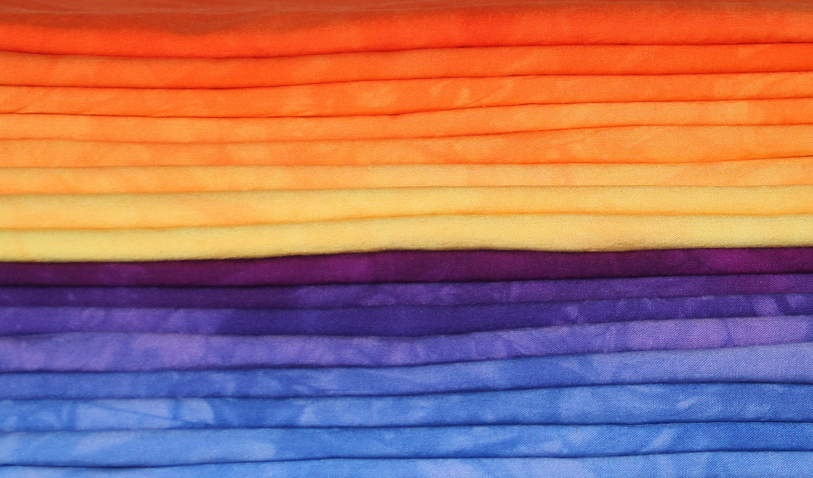
Here they are all stacked up and made me think that I need to do gradations between all the different colors. I know I have a yellow to green one but that leaves green to blue and an orange to red. Hmm.
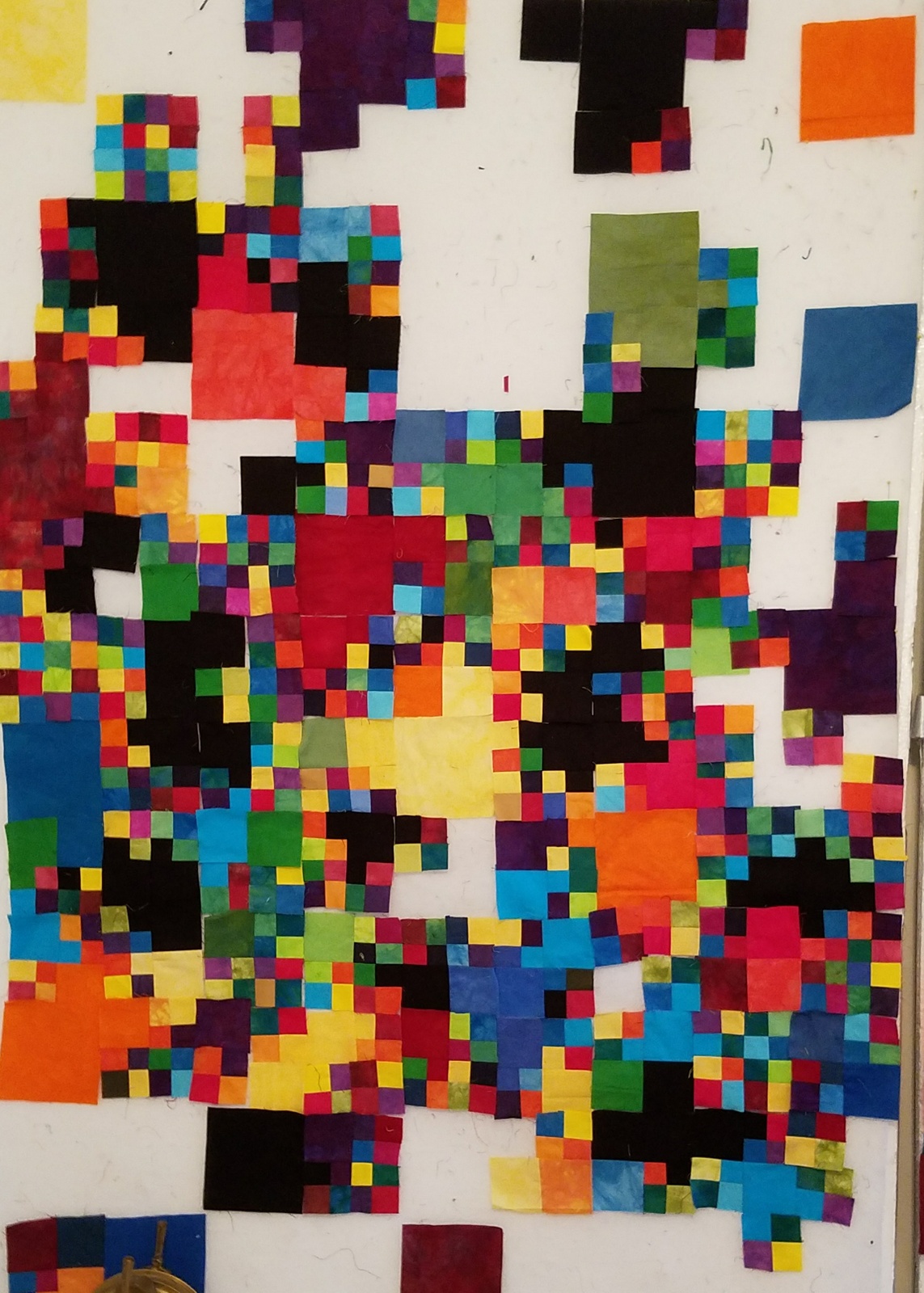
Well, in a few days I have finally made progress on City Lights. Each day I think I have made enough four patches, only to still have empty spaces!!
I try to take pictures at the end of each day. I only work for about 2 hours in the afternoon but if the weather is really bad, l may be found downstairs a bit more!
Almost done!!
Well, finally all the patches are done but far from being sewn together. Let's hope for no big breezes!! That is one jigsaw puzzle I don't want to put together!
I decided that I liked this orientation better and more in line with the title as it is more a landscape!
I got together with my dyeing buddies yesterday. They did some extreme overdyeing while I just did some gradations. This one is a gradation of Boysenberry with a 3% solution of Basic Blue added to each pot. They are really a bit darker than this picture shows.
This was a gradation of Strong Orange with a 3% solution of Sun Yellow overdyeing it. I really prefer to do it in one step but got lost in the process. Again, think they are darker than the picture shows. I wanted to do these as a sunset quilt is in my future.




 Posts
Posts


