Showing posts with label beginning dyeing. Show all posts

Monday, October 11, 2021

Some Miscellaneous Upates!

I have had 104 of these stack and whack blocks done for a couple of years and decided it was time to finally put them all to use!  In a previous post, I showed the column  arrangement for a bigger quilt.  I decided I would utilize the rest for baby quilts and put nice babyish fabric on the backs.  This was the first top completed and measures 40 x 40.


This is the second one which I should complete today!


I had 18 blocks left and I like to make use of every block so came up with this arrangement.  I have since switched the blocks around so it is a semi-one block wonder!


A bit of a challenge trying  to get this one arranged the way I wanted.  I had managed to put individual units upside down and had to rip out stitching and thought I was finished but after looking at the picture, realized that one whole side was now upside down so today I will fix that.  I wanted them to alternate to give a little variety.  I will use the green for the binding.


The other day my friend Dianne and I did some ice dyeing and regular vat dyeing of some extra wide pfd fabric I had.  The top two are ice dyed, the top one mostly navy and the middle one a  mix of navy and grape dyes.  The bottom two are just fat dyed, the top one grape with a bit of eggplant and the bottom one New Navy which looks like denim blue to me!


The top one  here was ice dyed and is a mix of the navies and the greens below.  It is much prettier in person.  For some reason, the color didn't come through so much in this picture.  The bottom two are vat dyed, the top one being a mix of sun yellow and Dharma's Desert Green and the bottom one being Bright Green.  I can never have too much lime green!!


My intention for the dyeing was to make some backs so each of the pieces is about 45 inches x 60  inches.  Probably won't use the vat dyed fabrics for backs as my free motion stitching isn't good enough for a plain back!


This isn't a great picture as I took it at night with my phone!  It is the bottom left of the Passacaglia quilt which I finished sewing together last night.  The rosette in the furthest right position on the bottom (red and green) was wrong in the pattern so I had to add an extra star and diamond to what I thought was a completed rosette.  Of course, the fabric I used to make the original rosette was still in Rochester, I had to improvise and it is roughtly right and you would really have to look to find it!  I am going to add another rosette to the far left side.  The pattern literally calls for cutting off large portions of the rosettes when you add the border and there is no way I would ever do that so need to even things up a bit more and then I will applique onto something.  I haven't yet decided what color I will applique onto but am thinking a really really pale yellow.  I have considered black as well but the quilt will eventually tell me what it wants and I am powerless to object! 


Monday, December 21, 2015

Another Day of Dyeing!


Dianne and I got together to dye again this Thursday and first we did a little show and tell of what she had done the week before.  This was one she did with the New Black from ProChem.   


 These were three pieces done with an Intense Blue and put on large poles on the diagonal.  The first was an overdye on a Mixing Red.
The top piece was scrunched and tied up and dipped in a dark green.

This piece was wrapped on a small pole on the diagonal and squished down and dyed with a mix of brown and black.  The Basic Brown is always too reddish for me and I like this dark chocolate.


This was done by doing hand stitching and pulling tight and dyed with a mix of Scarlet and Basic Brown.

 I was anxious to try the new Gray that is a pure color (and not a mix like all previous grays).  Both Dianne and I did a gradation using the same concentration of dye and one yard pieces.  This is Dianne's result and below is my result.


Mine are obviously much darker and I had a bag break so I think that is why the one piece is lighter than I would expect.  The difference -- hers was pfd and mine was pfd and Mercerised which gives you a much deeper color which really shows here.

 I can finally use up the remaining Mixing Gray I have hoarded since 1999!!  They stopped making it years ago and it was a prepared gray.  This was is just great and I am so happy I happened upon a Facebook posting which pointed me to Carol Soderlund's blog on the new color!

I also did another gradation which I had great hopes for.  Like a beginner, I somehow forgot to add the soda ash!!!  So I got a bunch of very pale blue pieces of fabric!  Well, into the overdye pile!!

I did throw some pieces of pink fabric into a couple of the pots to overdye the and they are pretty boring and will get overdyed again!!  This was a bit of a surprise.  I had a set of fat quarters that were a gradation of Mixing Red and not particularly exciting.  I overdyed them with a 3 percent solution of Sun Yellow and got a really nice gradation and I could definitely see them in flowers in the future.  I really do like the effect you get when you overdye a gradation with a set percentage of another color.  

Now I am trying to figure out what colors to come up with in one of our Extreme Overdyeing events a week from tomorrow!

Tuesday, October 28, 2014

A Day of Dyeing!


 Yesterday was a lovely day of dyeing with Dianne at her home which was an ideal setup for dyeing inside which I can't do here.  She had a whole bunch of Dharma dyes in a lovely assortment of colors but not what I am used to (I used pretty much "pure" dyes which I get from ProChem and do my color mixing myself).  It was great fun to experiment with the two blacks that she had, both of which were great.  We did the standard gradation dyeing with 1/2 yard pieces of fabric.  We decided we would like to see some of the "mushing" effect so instead of putting dry fabric scrunched up in the baggies, we wet the fabric down thoroughly before adding them into the baggies filled with the dyes.  We started with a cup of  chemical water (urea water) with one tbsp of dye dissolved in it.  (For the one half yard pieces, we first put a 1/2 cup of the dye in the first bag, filled the cup of dye solution up to the one cup mark again, dumped half in the second bag etc. through 8 baggies -- we used gallon plastic bags which I reuse  until they develop holes.)  I really like the variegated look.  This was Dharma Black 39 and a straight gradation.

This was a variation on the gradation theme.  I did a gradation of Dharma Blueberry and then added 1/8 cup of the New Black dye solution to each of the baggies.  In retrospect, I probably would have used less of the black than the 2 tbsps per baggie as it was pretty intense.  The New Black gives a great grey while the Black 39 does give a great charcoal but in the lighter shades I can see a teense of green.  Blacks usually bias to one color on another and as they age, they also change as the reds they used to make it seem to age the worst.  I was extremely pleased with these although I would like more yardage.  I am actually going to order some dyes as Dianne wants to dye some more -- Yay!!!!

These were all the baggies lined up in their tubs while we waited for them to "cook".

This is Dianne's dog Sophie who made sure we were doing everything right.  She has the prettiest face I think.  She was a rescue dog from a puppy mill and had had a rough life but now has the easy life with Dianne.

Of course no visit to a quilter is complete without showing some of the quilts adorning her walls.  She used to work for the Foreign Service and has wonderful exotic prints from her last assignment in the Cameroons.  She also was stationed in Italy and Katmandu, Napal!!  

This is her African Ladies showcasing many more of those wonderful prints.

I loved this use of the brightly colored prints and may just do one like this using my marbled fabrics which stump me many times.

Loved the beautiful colors and of course the hexagons!!

Hard to see, but this is a picture of the partial solar eclipse we saw here on the east coast last week.  The pelicans flying by were just icing on the cake for me.  You have to look closely at the right side of the sun to see the chunk that is missing.

Sunday, September 28, 2014

My Fabric Dyeing Class!

I had been asked to have a dyeing workshop for the Quilters By the Sea group I haven't taught this class in a number of  years but did manage to find the old directions on a cd.  I decided to do my old standard gradation with fat quarters and then just have a play day for the ten members who signed up (we had to cut off there as we were doing this at Miranda's house).  Pat Mattison helped me with the ladies as well as the take down and clean up.  Miranda did a Herculean effort getting everything set up and flawless although she didn't get to do any dyeing.  She did take lots of pictures and I have included a couple of these.  Not only did I forget my sd card in the camera (Miranda lent me one) but I just didn't remember to take pictures as we went along -- too busy I guess trying to remember everything I wanted to tell them!!

All the ladies are gathered around their tables.  This technique using plastic bags and a dishpan to hold them takes up very little room.  We had a bucket of clean water at each table and later a bucket of soda ash solution at each table.

The ladies were each taking a quarter cup of the different dye solutions (5% solutions) to dye their 8 step gradation.  This meant the strongest was about 6% and halved at each step.  Loose instructions for this are on one of my other blog posts.


You can see the fabrics "curing" in their baggies during our play time.  We had lots of dye to play with and I had brought extra pfd fabric as well.

Doing the preliminary rinses to get out the soda ash before washing in the washing machine at home.

This looked like a colorful bucket!!


This was Betty V's gradation of a greyish green.  It should have been more green but I think because of the chillly temps, the tangerine didn't take as well as it should have.

You can see here Karen's finished pieces.  The ones on the right are a gradation of Intense Blue.  I had a lot of white on white snowflake fabric which I shared with the class and I love how Karen's pieces turned out (pictures taken from a note she sent me)!


Betty got some nice solids (she had wanted solids).  It shows that you can get some really nice solids using low water immersion dyeing if you squish and message the baggies enough! I took these pictures from Betty's Facebook posting!

Some just sprinkled the liquid dyes on folded pieces of fabric (note the snowflakes).

Scrunched with yellow and blue dyes.  This is the back side of one of the snowflake fabrics.


This is the back side of a snowflake fabric.

This is the front side of the above piece!

Another back side of one of the snowflake fabrics.  Got some nice deep colors with this one!!

There was a lot of dye left so I took the opportunity to throw in a couple of tshirts which I will post later when they finish drying.  Don't think they are my best efforts but they are okay!

All in all, it was a fun day and Miranda's location is gorgeous and the weather behaved for the day as well.  Her garage was a perfect setting with plenty of room!


Thursday, July 4, 2013

Gradation Dyeing -- Easy, Easy

As I didn't want to do any more big overdyeing sessions for now, I switched over to doing some gradations of colors that I needed.  This was my first - Mixing Grey -  which is using a color that is no longer (and hasn't been for over ten years) in production at Pro Chem.  When I asked them about it at our recent quilt show, they told me to hoard every teaspoon as one of the colors used to make it is no longer available commercially!!  This dye is at least 14 years old and it still does an AWESOME job of giving you nice greys!!  As I used up a lot of my greys doing the Colin quilt, I decided to do a two yard/color gradation and a nine step gradation from about a 10% to .03% concentrations!.

The gradations are easily the most simple type of dyeing giving you lots of fabric  using low water immersion techniques.  See my posting on Gradation Dyeing (under popular blog entries on the side).  I have stopped using plastic bags as I have been dyeing larger quantities of each color and even the good bags don't hold up.  Luckily I have a lot of one gallon containers from various sources (a lot from my pH Plus containers from pool suppliers).  These will work just fine for up to about three yards.  Only a little arithmetic is required!


This is a gradation of Basic Blue.  This is the only one of the pure blues to be biased toward red instead of green (navy, mixing blue and intense blue all tend toward the green side of the spectrum).  I have always loved this color as it looks so much like good sky fabric.  I have a bunch of batiste to make into nightgowns and I think I will dye them this very pale blue shade.  This is a gradation of about 6% down to .01%.  Each of the gradations is double the concentration of the one next to it.  I have found, however, that to show the real difference in color, you just take every other one and then you get two gradations with a great deal of variety.

I have another forty yards scoured so tomorrow I will probably do some                 fuchsia/brown mixes as well as some fuchsia/grey and fuchsia/strong orange.  I may try a very very light green with the sun yellow and a mix of turq and basic blue in tiny concentrations.  You get such beautiful mixes when you use colors all from the same palette which for this set of dyeing seems to be a sun yellow/fuchsia/basic blue.  Not sure I ever did a complex overdye using these three colors.  Of course ice is beckoning me as well....


Friday, July 6, 2012

The Newly Dyed Fabrics Part I

Well, my right thumb won't allow me to iron anymore!  I think it is from squeezing the trigger for the sizing I use when ironing my very wrinkled dyed fabrics.  My husband has been helping my daughter in NC, so I took the opportunity to do some long neglected dyeing as I have squirreled away a LOT of fabric for dyeing.  This time I used mostly the Egyptian cotton that I had bought tons of from Joanns (they don't seem to sell it anymore so glad I bought a lot).  It is like a pima cotton but a little lighter weight.  It takes the color very, very well and I suspect has a teense of sizing in it ever after being pre-washed in Synthrapol and soda ash as it dyes more evenly than my pfd fabrics although still gets the deep color.  This gradation is one of an old (2003) Mixing Grey from Prochem (no longer made but one of my favorites).  You can see that age hasn't hurt it.  I do get about the same color using 2 parts Deep Navy and 1 part Strong Orange.  The deepest gradation here is about 6% and goes by halves down (3%, 1.5% etc.).


This is the gradation of one of my very favorite "pure" colors -- Prochem's Basic Blue. Like turquoise, it is not a dark color but is the only one of the blues that tends to red rather than green (there is no such thing as a pure color -- blues will either tend to red or green, reds to yellow or blue etc.).  The camera bleached out the color of the top ones a bit as they are a pretty sky blue.


This is a gradation where I took a 2% solution of Basic Blue and added a gradation of mixing red which started at 2% in the darkest and then decreased by halves (1%, .5% etc.) so the lightest is mostly the 2% Basic Blue.  Doing this kind of gradation really mirrors somewhat the rows or columns in the Carol Soderlund books.  Keep one color constant across the gradation (same amount in each) and vary a second color.  You can also do "dueling gradations" where you start at either end of a group of fabrics adding the dye to do the gradation first in one direction and then starting at the other end, do another gradation.  You get some wonderful variety here but need to start with relatively balanced colors (ie, if mixing yellows and reds, start with much more concentrated yellows than reds).


Here are two gradations which won't be ironed for awhile.  To the right is a gradation of Black 608 from Prochem.  It was very old dye powder and I think the yellow part of it must have drifted to the bottom as the gradation was basically a mauve gradation and bore little resemblance to black!  To the right, is a gradation using the same black but using it half and half with Basic Brown.  If I had realized how mauve the 608 leaned, I probably would have u sed something else.  I love the deep earthy browns you get with this combination and used a lot of the lighter shades in the lions I did.


This is the pile from the Extreme Overdyeing exercise.  I started with five pots containing  3% Basic Blue, 1% Deep Navy, 3% Turquoise, 2% Intense Blue and 3% Navy.  I then overdyed with 3% Turquoise, 3% Navy, 3% Intense Blue, 3% Sun Yellow and 3% Lemon Yellow.  From this I get 35 combinations.  I wanted to see the interactions of the different blues to see if there were some combinations I really liked.  I also needed some blules to round out my stash.


I need to fill in my matrix with the results and will publish that in my next blog.  I should add that I was using dye powders that were no newer than 2008 in most cases with the Basic Blue being nine years old.  These might be a bit lighter but not bad!! I do keep my powders in air tight containers in a dark cool basement though!


Monday, July 18, 2011

Still Using Up the Leftover Dyes...

It is amazing how long these dyes are lasting.  I basically made a quart ea. of 3 colors -- blue, yellow and fuchsia in a 10% (only 6% for the fuchsia) solution for the monoprinting demo 10 days ago. (Note:  I use 10% solutions as it makes the math so easy for determining depth of shade -- 10 ml of solution will contain 1 gm of dye powder)  In the past, it has become obvious that the higher concentrations do stay unbonded with the water a lot longer -- maybe because of the dye to water ratio.  Anyway, I have now done (in addition to what was used in class) 8 t-shirts, 6 yards of wide cotton knit and four yards of my Egyptian cotton.  I still have half a quart of the yellow and fuchsia left and about 1 1/2 cups of the blue.  Wow!  And the best part is that I really like the colors that these three dyes produce together (sun yellow, intense blue and fuchsia).  They are all the brighter of the pure dye colors (turquoise is probably the brightest though and I haven't used any of that this time). 


This particular combination  is not one of Carol Soderlund's trios of colors  that she uses in her Dye Mixing class (which I highly recommend to anyone who has a serious interest in  controlled dyeing) but I did do many other combinations after I left the class to see what I could come up with - and this was one that I really liked.  I found that using fuchsia and turquoise together in low water immersion in anything but very low concentrations yielded too much separation of color as fuchsia is the fastest bonding and turquoise the slowest.  Maybe I will scan in some of my other results and do a blog on that....


My technique for the last bunch of dyeing is a little different from what I usually do.  I have pre-soaked all the fabric or t-shirts in a warm soda ash solution (dyeing in my basement and even in the summer, this is a necessity).  I then use those plastic tubs used for washing dishes that you find at the dollar store and put two tshirts or four yards of fabrics spread out very evenly across the bottom of each. I then make up cup solutions of about 2% solutions (I know that 20 ml of dye solution will yield 2 gms of dye which will dye 100 gms of fabric to a depth of shade of 2% or medium and then I just add water up to the cup level) of each of the colors (or whichever of the colors I am using) and then I kind of pour them all over, one at a time, smashing the fabric after each addition so that I maximize the distribution of the dye immediately.  I have been really going very, very light on the fuchsia even in its reduced concentration probably never using even a 1% solution as it overpowers very quickly.  The fabrics aren't sitting in big puddles and I figured I would use the timing for dye painting (4-8 hours) rather than the usual low water immersion time (1 hour).  So far, I have been spectacularly pleased with the results.  Some are almost as nice as my snow dyed fabrics.  With consistent 90 degree temps around here, we won't be seeing much of that for a while!  I may play a bit with salt dyeing though and try something a little different -- we shall see.... Turquoise, however,  is the best for this!


This was my very favorite of the fabrics I dyed although I don't think the subtlety can be seen in this image of the two yard piece.  It will be enough for a tshirt for me!
Last but not least are the socks.  I am getting smarter and dyeing them in batches so that I have many of the same colorway so that matching and losing socks is not such a problem!!  They will match my t-shirts as well.  These brightly colored socks even get a laugh from my daughters (after the eye roll of course).

Thursday, July 7, 2011

Monoprinting with Thickened MX Fiber Reactive Dyes at RAFA

Part of our day long monthly meetings is a short program to expose members to some process or technique with which they may not be familiar. These are not intended to be full blown classes but are usually longer than just a demo. Different members of the group are called upon to share a sample of what they may be teaching professionally or just something they like to do. This ranges through all types of surface design as well as felting or working with beads or even finger weaving.

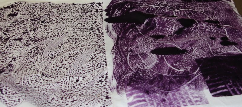
The above is purple brushed on new heavy weight plastic on the left and purple smeared onto a sheet of the play foam for kids as well as some stamping with painted blocks.


Today I volunteered to do something related to dye painting and chose something relatively simple which was monoprinting. In various classes I have been in, we have done an assortment of techniques and I tried to share as much as time would allow.

Here, someone dropped some colors onto the foam or plastic, put the fabric on top of and then brayered the fabric causing the dye to spread out. I love the effects you get doing this.

I asked everyone to bring pfd fabric that was prepared by soaking in soda ash water (1/2 cup soda ash to 1 gal of water) and then drying on a line. I suggested fat quarters. I also asked they bring small cups for their dyes and foam brushes and white trash bags for transport and for their workspace. A brayer or roller foam brush was optional. I also sold some prepared fabric for those who were new to dyeing (we had two in the class that had never used MX dyes before) and several that were pretty expert.

I provided 2 ft x 2 ft masonite boards (I get the 4 x 8 ones cut down at Lowes and they are cheap). I also provided some heavy plastic pieces (about fat quarter's worth) and pieces of skinny foam (the kinds kids use and which I get in 3 ft x 5 ft pieces at Joanns). In addition, I had one large sheet of acrylic as well as several small pieces of that and foam. I also made up liquid dyes (sun yellow, fuchsia and intense blue) and print paste (1 cup powder to 3 cups water). I had some miscellaneous sticks and whisks for stirring. I used squeeze bottles for the dyes as that was the most effective for mixing it with the print paste with 10 people. I used up almost all the print paste I brought (6 cups) but had lots of dye left over (I made a quart of 10% solution for the three colors).

The techniques included:

1. slathering with brushes or sprinkling dyes on either plastic, masonite, foam or acrylic until you got colors and a pattern you liked. Then place the fabric on the surface and use a brayer to insure nice even coverage. As the surfaces are used more and more, there is less puddling of the dyes. Of course you can do the same piece over and over again too.

2. slathering dyes on a small piece of foam and then using some sort of pointed object to put lines on the foam and then using it as you would a rubber stamp on the fabric. I also had various different kinds of tile group spreaders with different patterns to use.

Unfortunately, it was a very humid day so the print paste was not as thick as I would have liked. I would do it thicker the next time. People in the class were incredibly creative including one person who brought a toy truck in and use it to march across the surface.

Here someone painted colors onto the foam and then ran the toy truck all over the surface and then printed the fabric!!
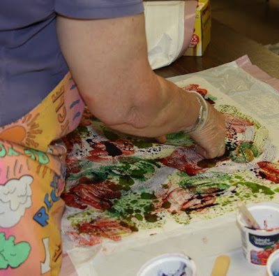


Here Donna is working on a piece.


Joyce decided to do some direct dyeing by painting directly onto the fabric. Joyce had done monoprinting before but not with fabric and really enjoyed it.


Here Val took some already dyed fabric and monoprinted on top.


Julie brought in a tshirt that had been ruined by some stains. She splashed some thickened dyes onto a piece of plastic and then pressed the tshirt onto it to give this Jackson Pollack like result. She was thrilled as the stains no longer showed and the tshirt was retrieved!