skip to main |
skip to sidebar
City Lights is Finally Sewn Together!
I am very happy with how City Lights turned out and will keep it in this horizontal orientation. I think the green represents trees and little park areas while the blue areas are ponds. The rest is made up of shopping centers and tall buildings casting shadows.
This is the vertical representation.
I finally ironed the gradated Boysenberry to Basic Blue. The deepest shade is 10% Boysenberry and 3% Basic Blue. It is really rich and dark as are the 5% and 2.5% Boysenberry. The Basic Blue is 3% in each piece.
This is the 2.5% Boysenberry and 3% Basic Blue. I really liked this one and the next one which is 5% Boysenberry and 3% Basic Blue.
I thought this one was very rich looking!
This is the Strongest Orange overdyed with the 3% Sun Yellow. They are all ironed now and that is the most fun part of the dyeing process!!
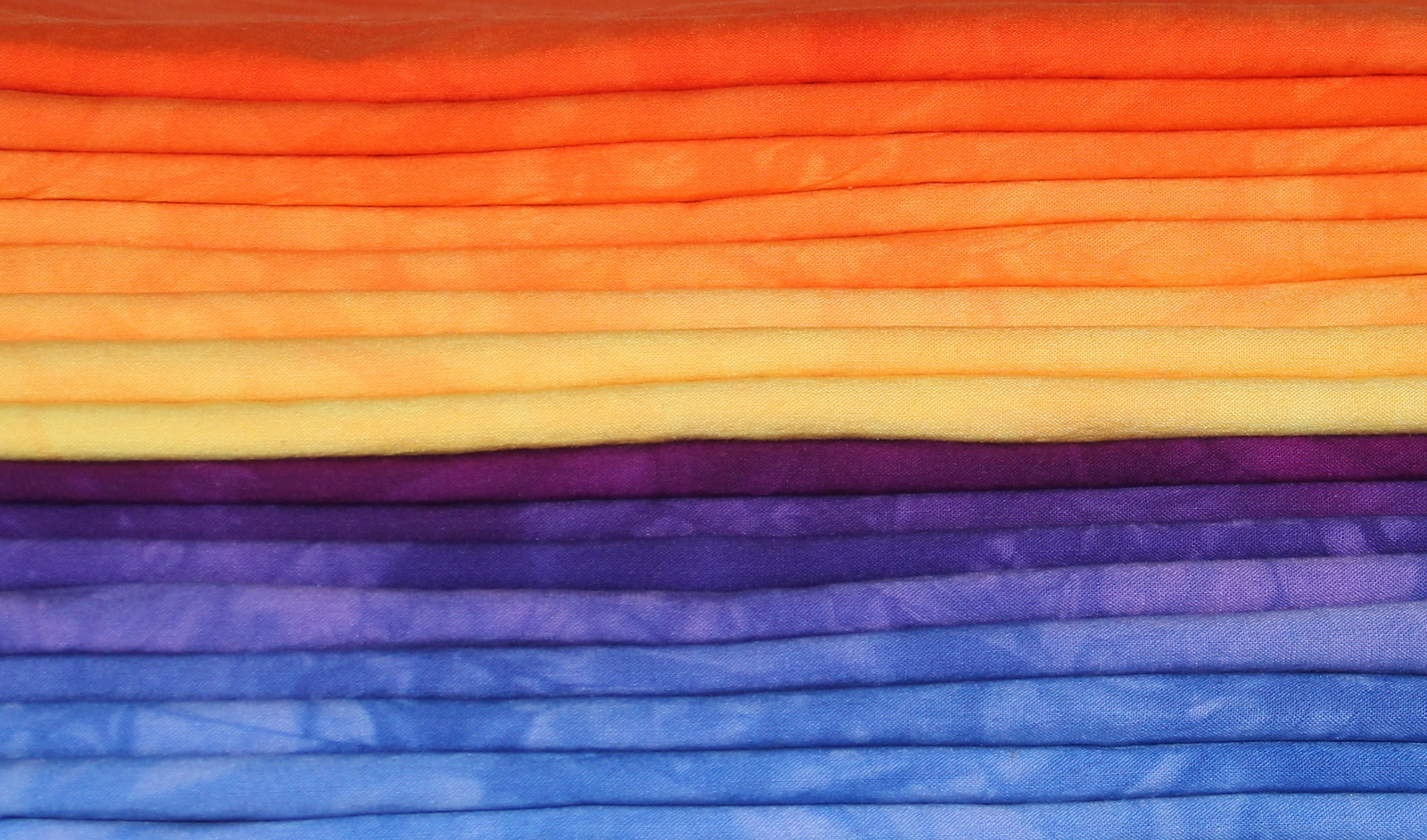
Here they are all stacked up and made me think that I need to do gradations between all the different colors. I know I have a yellow to green one but that leaves green to blue and an orange to red. Hmm.


4 comments:
Your quilt is stunning and the fabrics are fabulous. I'm still ironing, 20 down 15 to go. The colors are amazingly beautiful. Will send you photos when I am done.
I love your quilt. It was fun to see it come together. I also love your dyes. It makes me want to get into it again very soon! How much fabric do you dye in each variation? It looks bigger than a fat quarter. What fabric do you like to dye with/sew with best?
WOW!!!! Just love it.
I generally do a yard or two of each of the gradations. They can fit into a gallon sized zip lock bag which is what I use for dyeing (low water immersion ala Ann Johnston). I use any fabric I can find that is pfd and mercerized. Currently I have been using Kona pfd and the cheapest pfd mercerized fabric that Dharma Trading sells.
Post a Comment